Website RefreshCase Study for a much needed website refresh. A webpage that keeps up with modern technology and establishes trust in users.
Project Overview
Overview
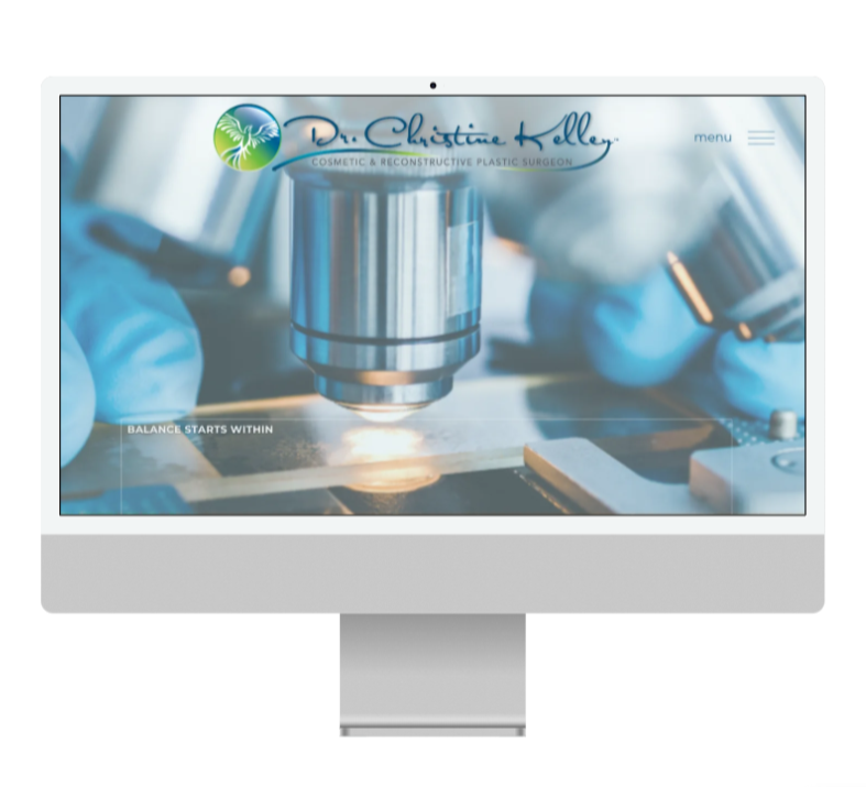
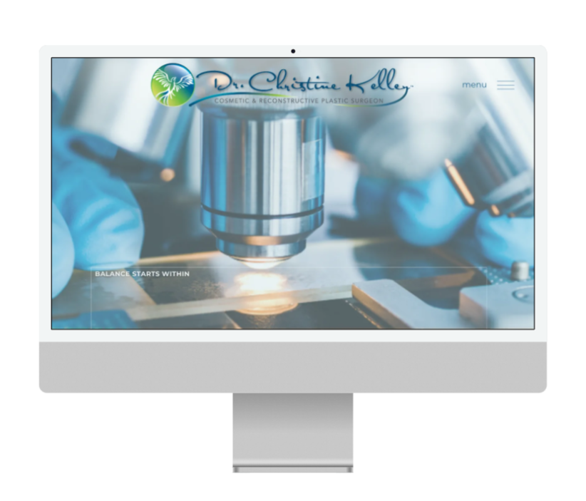
A refresh of a physician's website that transforms the archaic design into a modern digital experience. A design that reflects the doctor's surgical precision and integrity.
The upgraded site will serve as a trusted resource; informative, concise and professional. Helping patients make informed decisions and feel seen, supported, and confident in their journey to healing.
02 - Design
Modern design maintaining current brand color palette and logo. Tone of Voice: Informative, Educative, Professional. Color(s): Blue and Green
Updated UI/UX design for optimal user experience.
Accessible to potential patients who may not know medical terminology or the best procedure for them. The website will be a transparent resource to leave potential patients informed.
The TOV instills trust in the physician and will drive patients to schedule consultations for their personalized care plan.
-50%
user drop-off
+40%
web conversion rate
03 - Impact
Though this project is still ongoing the projected improvements will be instantaneous. With the removal of the narrow/portrait design makes the screen wider for visibility and looks like a more proper fit for a desktop screen. This major shift in screen fit will make the webpage immediately more up-to-date. The old/current web design is very archaic and lacks serious navigation features where some buttons either don't work or aren't intuitive in where to click them. The ease of access and visibility across devices will translate to more trust with prospective patients and an overall increase in user satisfaction of experience.
+25%
user CTR
-
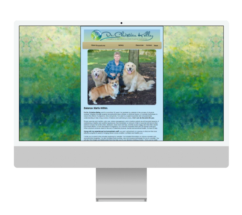
Before
-
After